Bridport Food Matters
Branding Project, Poster Design
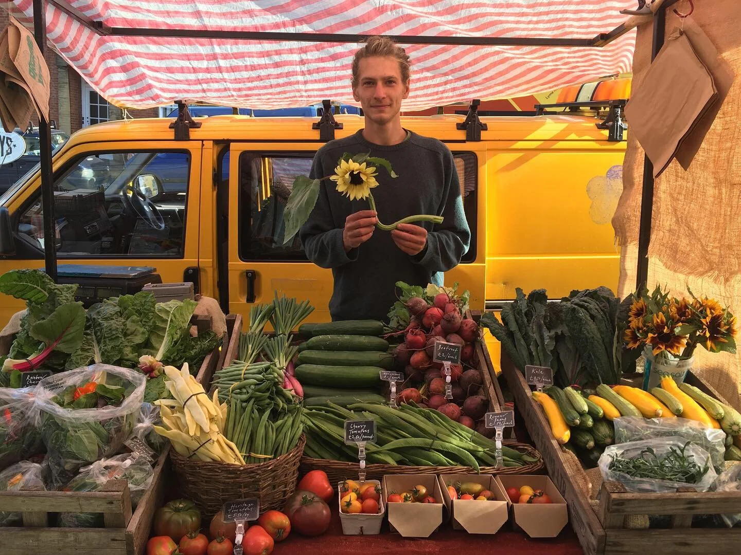
Bridport Food Matters is a grassroots charity working to strengthen the local food system through cooperation, education and mutual support. With deep roots in the community and a focus on food equality and resilience, the organisation brings together growers, producers and volunteers to build a fairer, healthier and more sustainable food culture for Bridport and the surrounding area. As the charity evolved, becoming a Community Benefit Society and planning the launch of a new Community Food Hub, they felt it was time to develop a visual identity that better reflected their mission. They approached us to help shape a brand that would capture the spirit of collective action, nourishment, and positive change.
The Brand
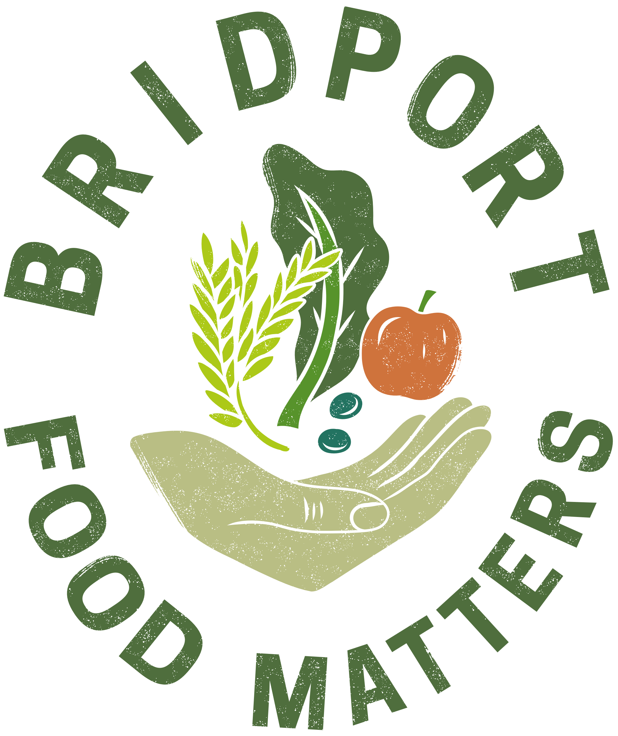
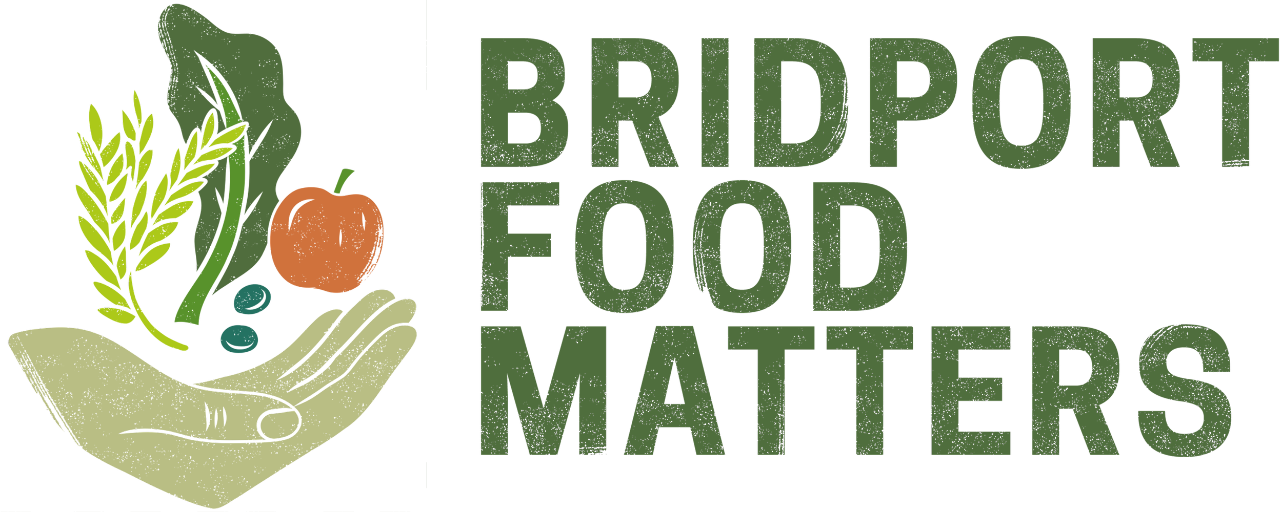
The goal of the branding project was to create a visual identity that captured Bridport Food Matters’ mission of building food resilience through community, while remaining warm, grounded and broadly appealing. The brief highlighted the need for something modern but not overly polished; something that reflected the agricultural roots of the area and the collective energy behind the organisation. We began by exploring four potential directions, including colour palettes, fonts and illustrative logos. The chosen concept was inspired by block-printed activism posters and featured a hand offering seasonal vegetables, symbolising care, nourishment and cooperation.
Through collaborative feedback, we refined the design to feel softer and more versatile, shifting towards a simpler, circular layout and introducing a textured linoprint effect. This gave the final logo a handmade, tactile quality that felt rooted in both place and purpose. Alongside the core identity, we provided a set of flexible style guidelines to support BFM’s evolving needs across digital and print media.
The logo design process centred on creating a distinctive, eye-catching mark that would be both versatile and meaningful. Inspired by block-printed textures and grassroots activism, the final design features a single hand holding a small bundle of vegetables, symbolising nourishment, care, and collective action. To reflect BFM’s values and allow for flexible use across platforms, we created multiple colourways for the logo, from bold and bright to earthy and grounded. Each version was designed with intention, ensuring the logo would stand out while remaining approachable and familiar. The textured linoprint finish gives the design a handmade feel that echoes the charity’s community-led ethos, while the circular shape reinforces ideas of unity, sustainability and the seasonal nature of local food systems.
Brand Logos
Poster Design
To support Bridport Food Matters’ presence at local events, we designed a A1 posters to communicate the core values of the organisation in a bold, accessible format. Centred around the statement “Good food for all, forever,” the posters introduced the Bridport Good Food Charter, outlining what good food means for people, place, and planet. The design incorporated the new logo alongside clean, legible typography and warm, earthy colours to echo the organisation’s brand identity. A subtle block-print texture ran through the layout, tying it visually to the linoprint-inspired logo. The aim was to create something eye-catching yet informative, engaging both adults and children at school fairs and food festivals. Each poster included a QR code and web address to encourage further involvement and make it easy for people to connect with the project beyond the event.
