Nourish
Branding Project
Nourish is a community café and hub in the heart of Bridport, created to support local food resilience and bring people together through good food. It’s a multi-functional, family-friendly space offering affordable meals made with local, seasonal ingredients, with a strong focus on inclusivity through ‘pay it forward’ and ‘pay what you feel’ models. Long tables encourage conversation and connection, while the space hosts workshops, talks, cooking demos and pop-up retail showcasing agro-ecological producers. From shared meals to skill-sharing and growing projects, Nourish exists to build a more connected, food-literate community.
The Brand
The branding for Nourish was designed to sit comfortably within the Bridport Food Matters family, while establishing its own vibrant identity. We kept core elements from the parent brand—such as font choices and block-printed textures—to maintain visual continuity, but introduced a brighter, cooler colour palette to reflect Nourish’s fresh, contemporary feel. The brand had to speak to a wide audience, from families to food producers, and feel both warm and energising. The result is a brand that feels approachable and intentional: rooted in the values of community and sustainability, but with a distinctly modern flavour.

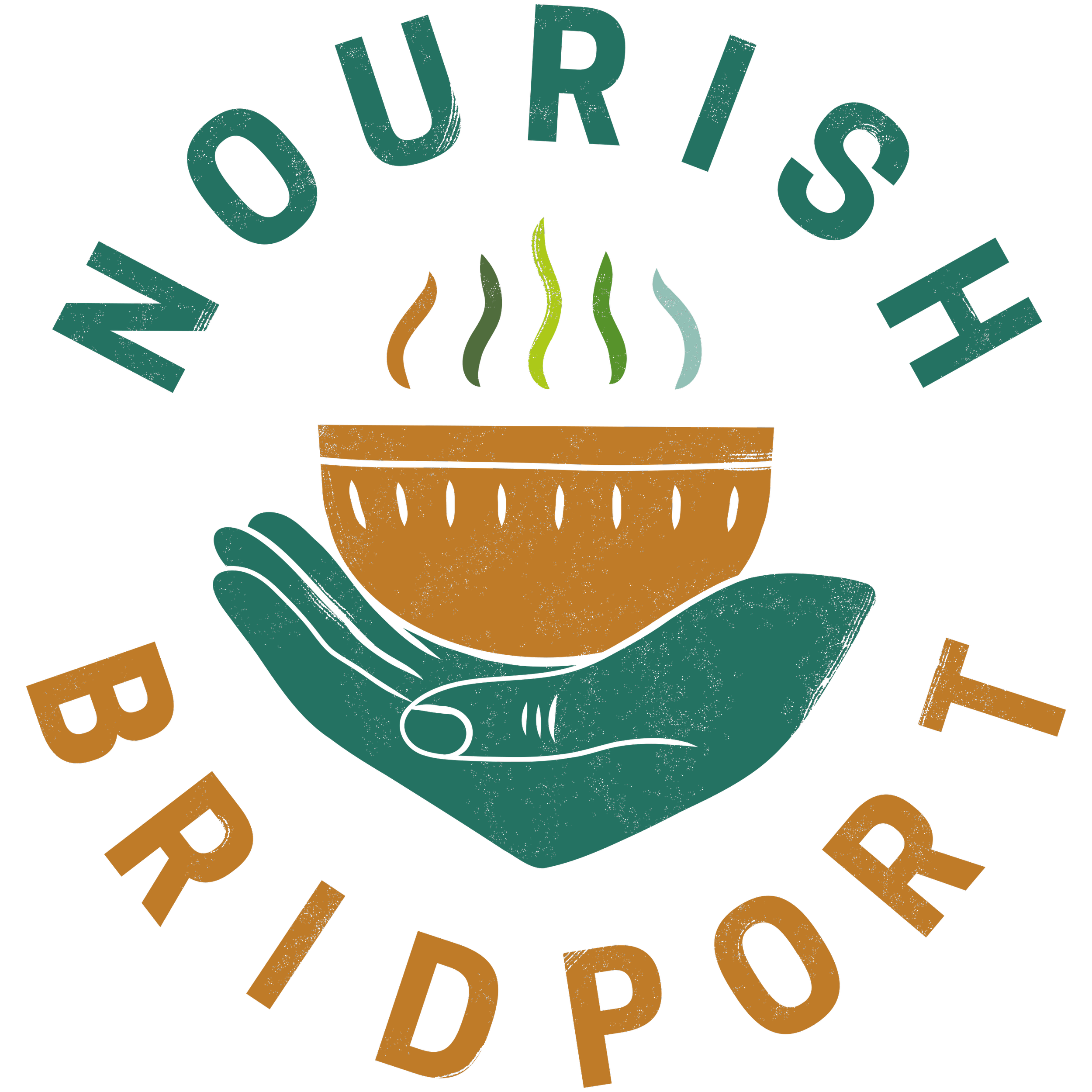
The Nourish logo captures the ethos of the project in a single, eye-catching image. A steaming bowl, cradled in a hand, conveys nourishment, care, and the sharing of food—key values of the café. The design makes use of texture and hand-drawn lines, echoing the linocut feel of the Bridport Food Matters logo while carving out its own presence. The multicoloured steam adds a sense of movement and warmth, while a range of colourways were developed to ensure versatility across digital and print formats. The circular layout gives it a strong, badge-like presence that’s easily recognisable in different contexts—from signage to stickers, posters and social media.
Brand Logos